Pivot Tables are a powerful way to summarize data in a comprehensive manner. Google Sheets allow you to create Pivot Tables through clicking Data > Pivot Table. In order to create the Pivot Table you need to select from which data range you would like to summarize your data and where you would like to display it.
If you would like to visualize data from Pivot Tables in Chartmat we recommend you to insert it into a new sheet. When you do that Google Sheets will typically display the relevant information of your Pivot Table starting from cell A2.
This means that you will need to change your data source to A2 under Board Settings.
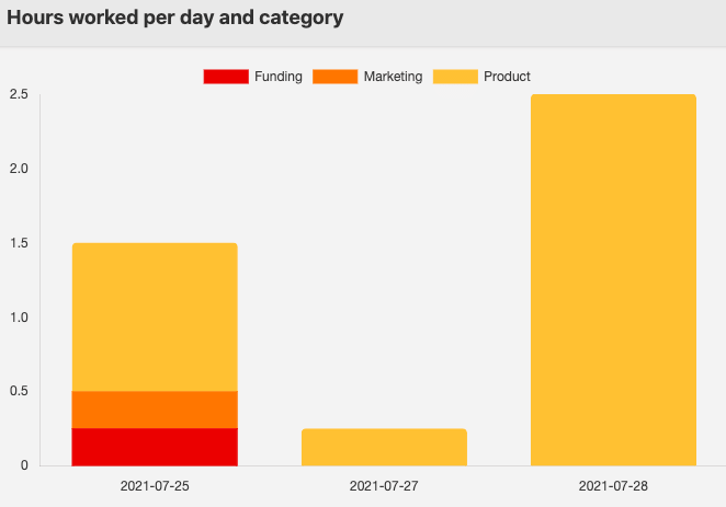
As you create your chart based on data of your Pivot Table it often makes sense to select the Stack Axis is TRUE option so that your data is displayed in a cumulative manner.
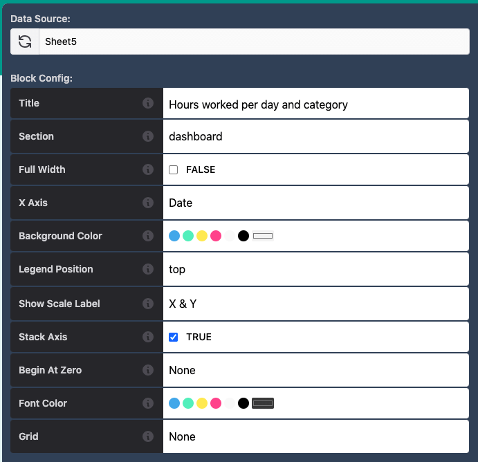
Note that the X Axis will be typically assigned to the Date values or whatever criteria by which you want to filter on the X Axis.
For the Y Axis you would select the remaining categories as data points:
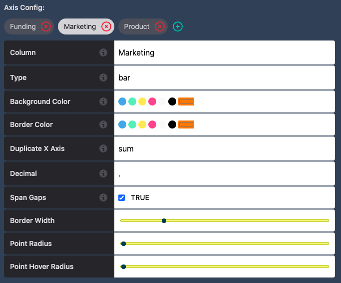
Make sure that you do not select the same data points on the X Axis and Y Axis!
An example of a Chart created based on data from a Pivot Table is shown below: