

The chart is one of the most popular blocks on Chartmat. It's fairly easy to build but this guide will help you handle even more complex situations.
First of all some ground rules:
- A single chart can have only 1
x axis, however it can have multipley axis - The y axis needs to contain numbers. Chartmat will remove all non-numeric characters for you, this is how your numbers will be converted:
$ 29.39will become 29.39$ 100,100,000.20/Yearwill become100100000.20
The conversion happens only on our side and your data is not edited or changed on your spreadsheet - Some block settings are shared among both axis. Below each y axis you have individual settings for each y axis. This means that you can have a
line chartand abar chartin the same chart (adding two y axis)
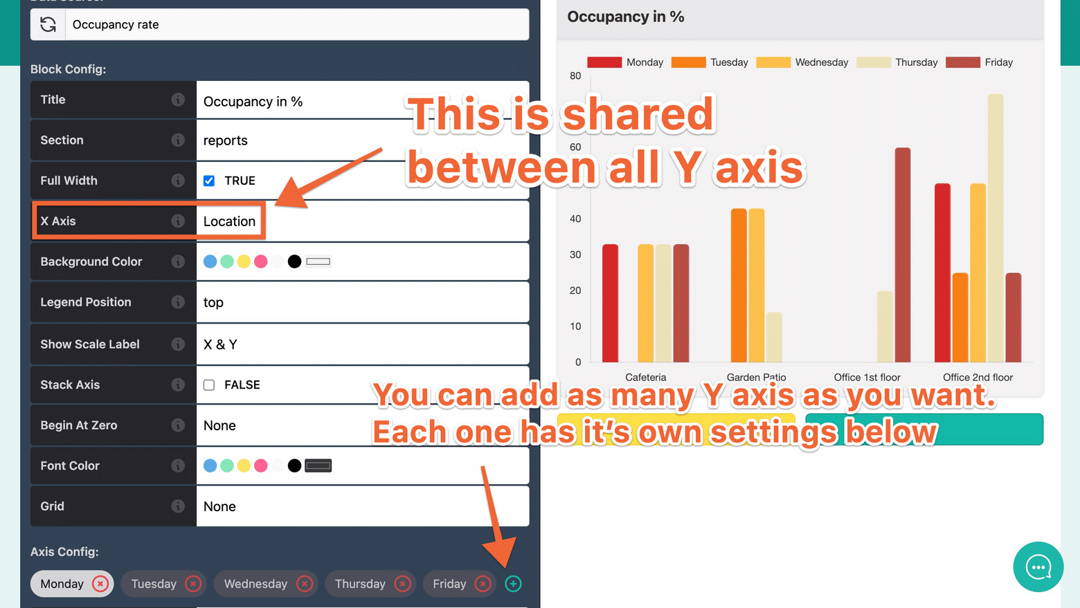
The x axis is the horizontal axis of your chart. In this case the value is Location so below the chart we can see Cafeteria, Garden Patio and so on.
The x axis serves usually as the date, while the y axis serves as the value. Make sure that you do not select the same data points on the X Axis and Y Axis!
Specific settings:
You can hover the (i) sign for short explanations, but here you have some more details for specific settings:
- Start from zero. By default charts don't start from zero. If you have the values 100, 130 and 140 the chart will start from 100 to clearly show you the difference. However, you can change these settings so that the chart starts from zero.
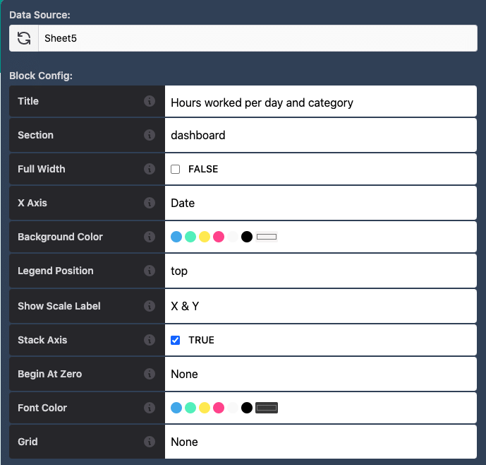
- Stack axis. If you have multiple axis corresponding to the same data point (often the case with pivot tables) you can change the block configuration to stack all y axis together. Simply assign the Stack Axis value to
TRUE.
As a result the data points will be displayed cumulatively as it can be observed in the table below:
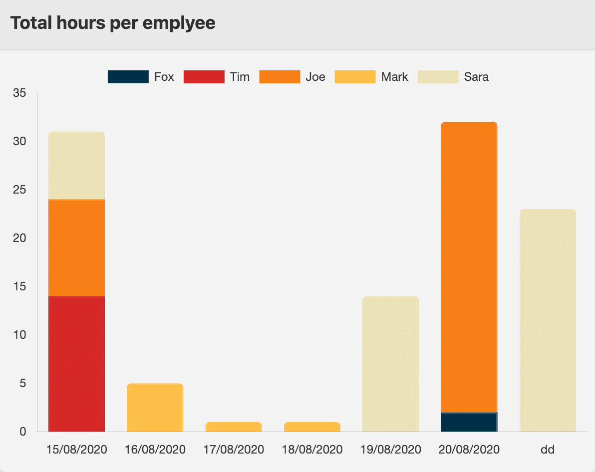 A stacked chart